How to create a simple SXA component
SXA contains the Toolbox feature, which provides Authors the possibility to drag and drop several components in order to add it to pages in the Experience Editor. You can also create a custom component and use it in the Toolbox like the out of the box components.
In this Blog post we will create a simple text image component and add it to the Toolbox. SXA uses the Repository Pattern to make the code cleaner, more maintainable and easier to change the model determination over dependency injection.
We name the text image component "e.g. SXA Component" and should have the fields:
- Title: single text field
- Subtitle: single text field
- Rich Text Editor: RTE Field
- Image: Image Field
First we create a Template, name it "e.g. SxaComponentBase" and we define the fields mentioned above.

If you use Glassmapper or similar mapper, create the model of the template.
After that we need:
- ViewModel: inherits from RenderingModelBase
- Repository Interface
- Repository: inherits from the repository interface
As already mentioned, SXA use the Repository Pattern, we will use also this Pattern. For that, we create an interface and name it "ISxaComponentRepository". Create a class "SxaComponentRepository" and inherit from "ISxaCompoentRepository".
The next code snippets are kind of an approach and you can use it like an example.
View Model
namespace MySxaComponent.Feature.Models

{

     public class TextImageViewModel: RenderingModelBase

     {

          //ITextImageTemplate is the model of the created template

          public ITextImageTemplate TextImageBaseTemplate { get; set; }
          //you can also here add properties as needed

     }

}
Repository Interface
namespace MySxaComponent.Feature.Repositories

{

     public interface ITextImageRepository

     {

          IRenderingModelBase GetViewModel();

     }

}
namespace MySxaComponent.Feature.Repositories

{

      public class TextImageRepository: ModelRepository, ITextImageRepository

      {

          public override IRenderingModelBase GetModel()

          {

               var viewModel = new SxaComponentModel();

               FillBaseProperties(viewModel);

               return viewModel;

          }

      }
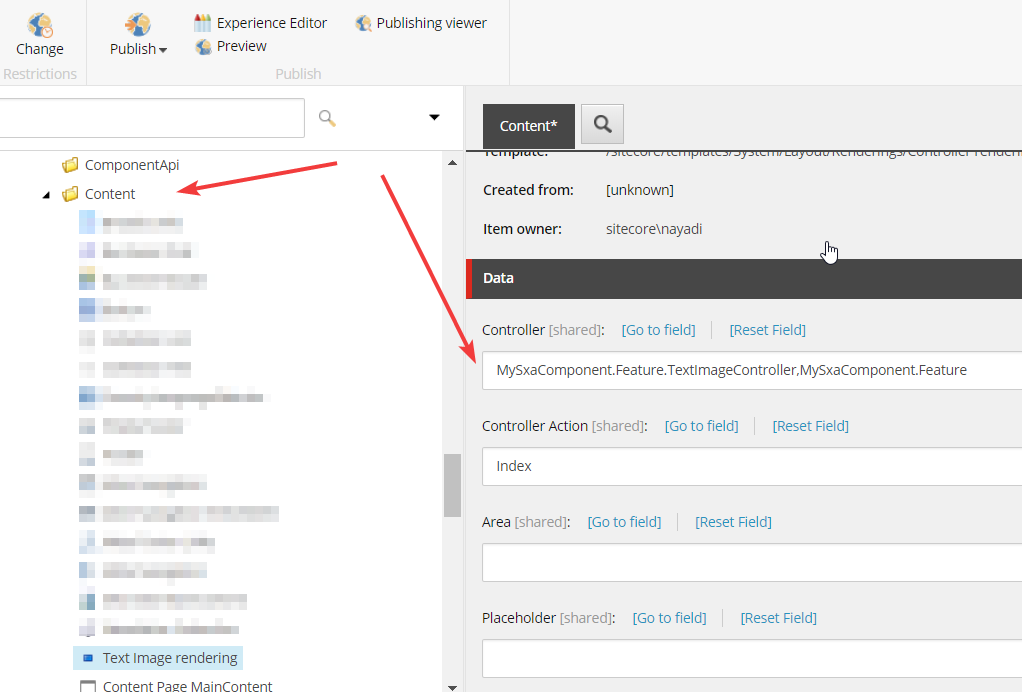
}After that, create a Controller and name it "e.g. SxaComponentController", it is important that the controller inherit from StandardController or from a class which inherit from StandardController, in this example we will inherit from the VariantsController.
public class TextImageController:VariantsController

{

       private readonly ITextImageRepository _textImageRepository;

       public SxaComponentController(ITextImageRepository textImageRepository)

       {

            _textImageRepository= textImageRepository;

       }

       protected override object GetModel()

       {

            return _textImageRepository.GetViewModel();

       }

}
@Model.TextImageBaseTemplate.TitleField.Render()
@Model.TextImageBaseTemplate.SubtitleField.Render()

                                               @Model.TextImageBaseTemplate.DescriptionField.Render()


@Model.TextImageBaseTemplate.DescriptionField.Render()
Now we created a controller, repository, view and its view model. After that we assign the created controller TextImageController to a controller rendering in Sitecore. Here is important to know that SXA resolve the path to the view file using the name of the rendering, so if you name the controller rendering like the view file, you don't have to assign the view file to the rendering, SXA will do it for you, as long as the name of the rendering is matching the name of view file
The Toolbox will show this rendering according to the allowed renderings within the placeholder used on current page and according to the folder structure under the rendering folder.
Page A contains the placeholder "PlaceholderA", the allowed renderings are "/sitecore/layout/Renderings/Feature/Content/RenderingA" and "/sitecore/layout/Renderings/Feature/Product/RenderingB", SXA will check the renderings allowed in "PlaceholderA" and add it to the Toolbox, the sections will be the name of the parent folders, in this case "RenderingA" will be showed within the section "Content" and "RenderingB" will be showed within the section "Product"
Now you should be able to find your created SXA Component in the Toolbox and with Drag and Drop you can add it to the placeholder used in your page.